8-week project, in a team of 4 (roles: Data Analyst, Interaction Designer- Me, UI Designer, Developer). We were tasked with redesigning the Too Good to Go app, based on user feedback. **Skills/Disciplines: UI/UX, User Research, Human Computer Interaction, Figma, Miro
RoLE •
Interaction Designer
CATEGORY •
UI/UX
DATe •
2023
Project Overview
As part of a team of four, I worked on redesigning the Too Good To Go app, which helps fight food waste by connecting users with discounted surplus food from restaurants. Our research revealed two big usability challenges: lack of a dark mode (causing eye strain) and cluttered navigation on the Browse and Discover pages. Our redesign tackled these issues by adding a dark mode option, merging and simplifying discovery flows, and creating a more intuitive filter system.
My Role
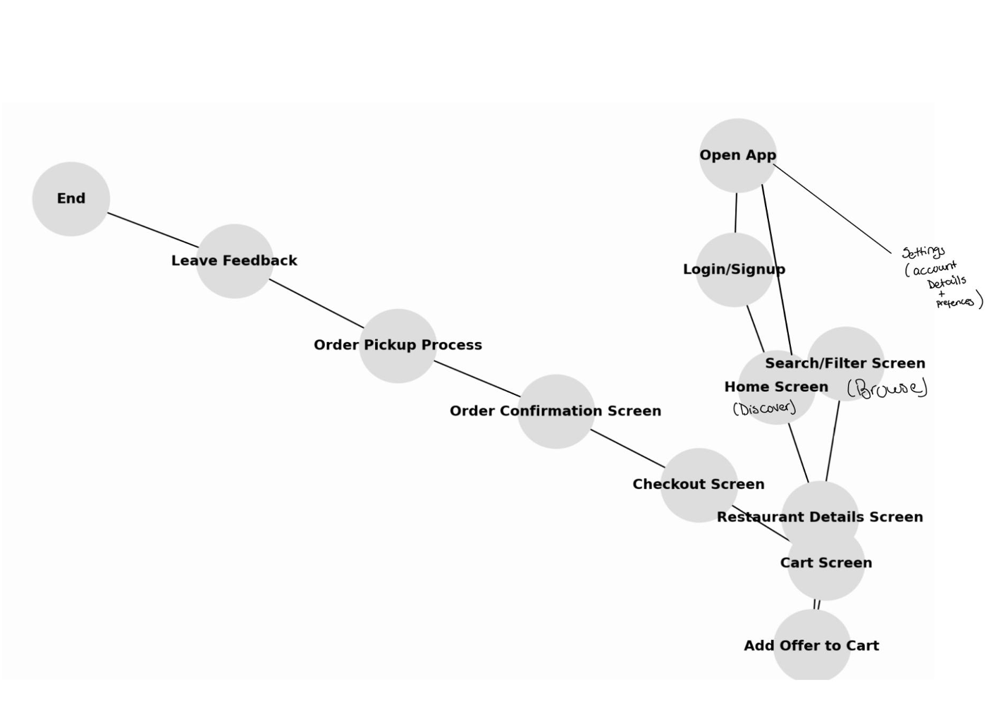
I led the interaction design, focusing on user flows and information architecture.
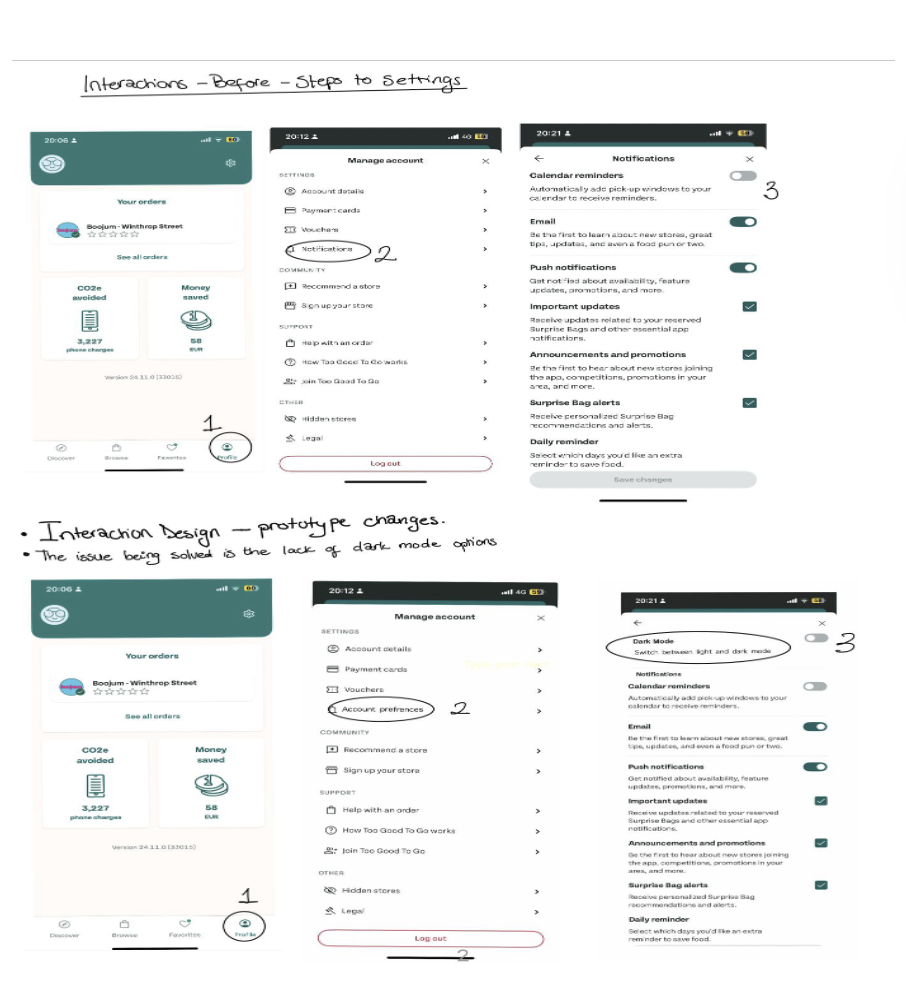
Designed a new Account Preferences section to house dark mode and notification settings in one place.
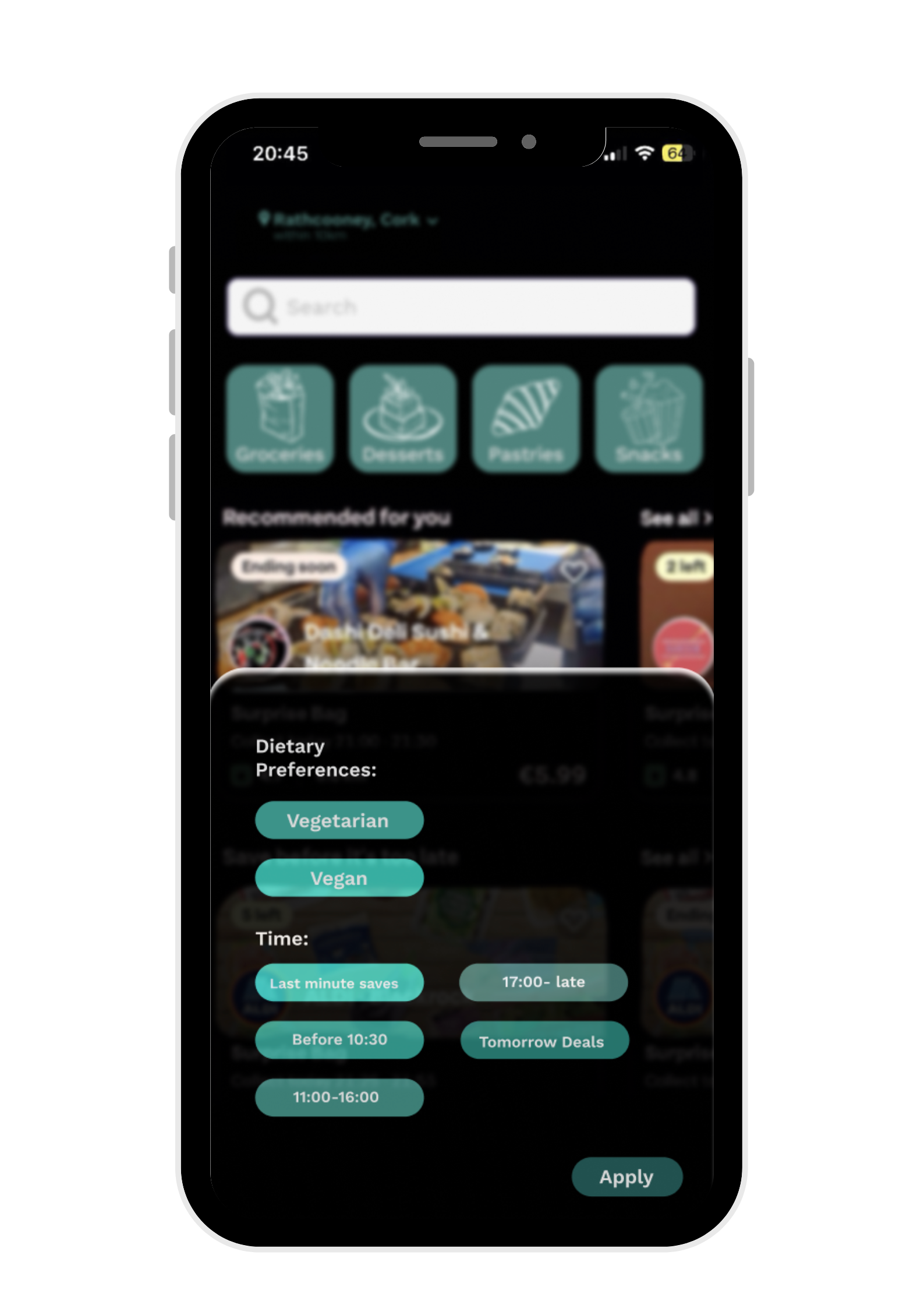
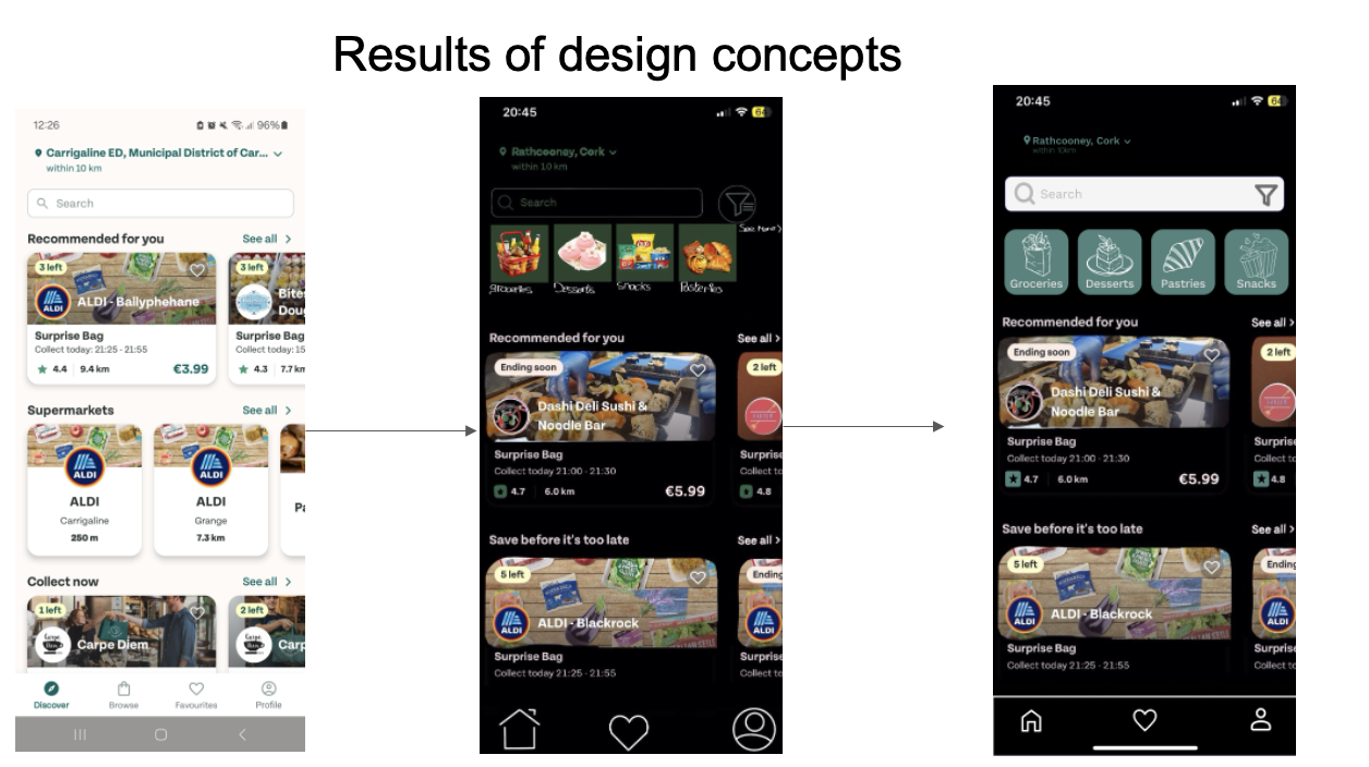
Reworked the Discover/Browse pages into a streamlined layout with collapsible filters and direct category navigation (e.g., “Pastries,” “Supermarkets”).
Collaborated with teammates on UI choices, accessibility features, and ensuring the prototype translated smoothly from Figma to functionality.
Our Process
Research: We each conducted interviews and surveys with 5 participants (students + professionals, buyers + sellers) using the original app, in the city of Cork, Ireland.
Prototyping: Built redesigned flows in Figma, emphasizing navigation clarity, accessibility, and reduced clutter.
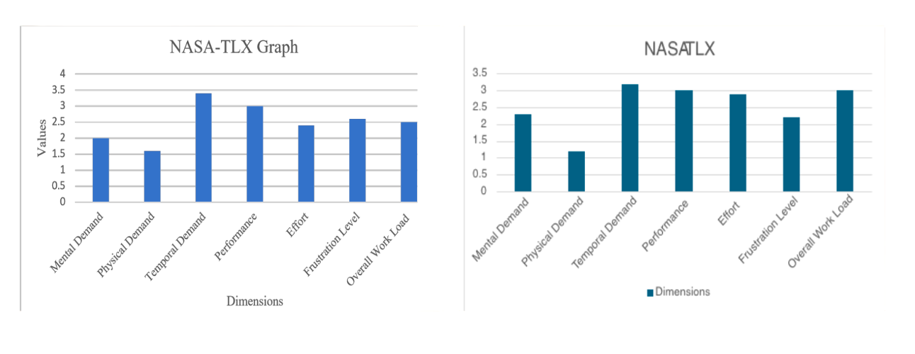
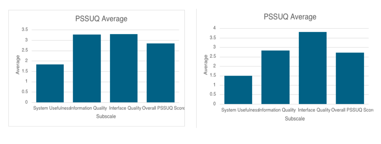
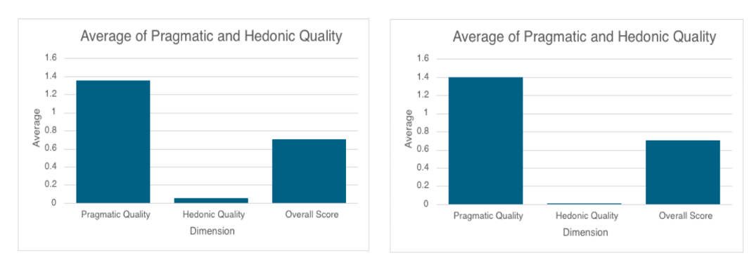
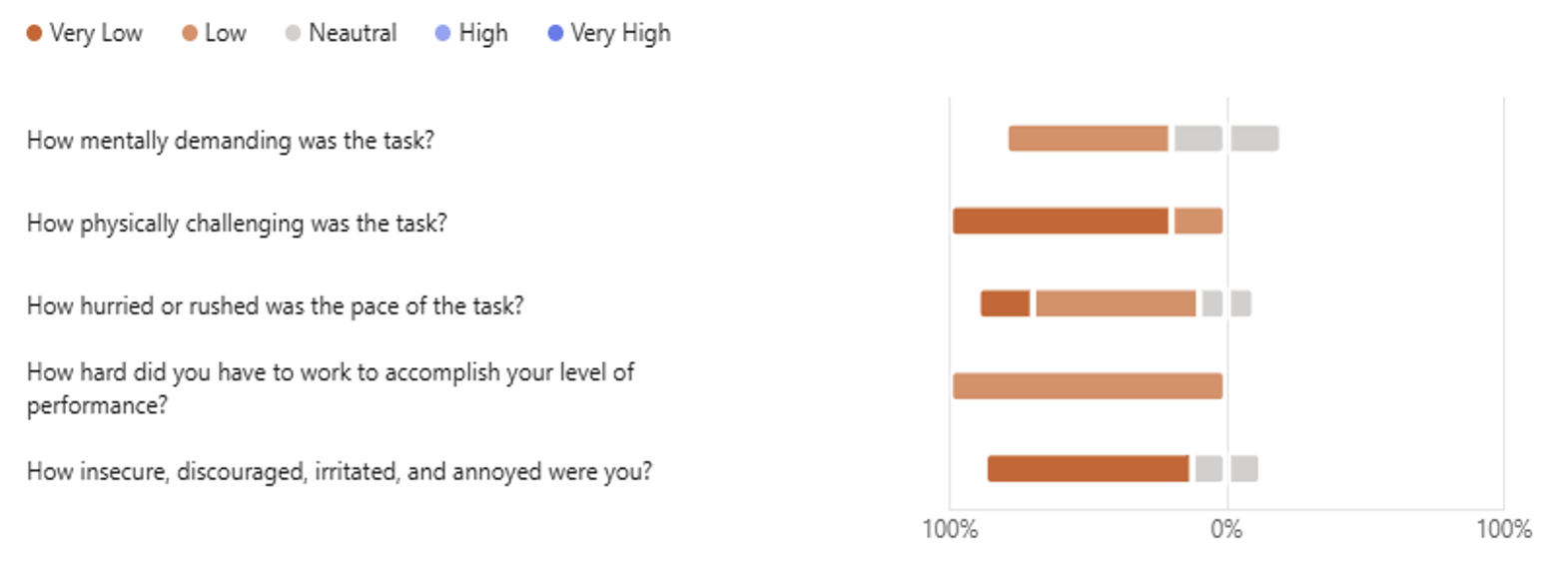
User Testing: Ran usability studies using NASA-TLX, PSSUQ, and UEQ-S metrics, plus semi-structured interviews.
Iteration: Incorporated feedback and balanced functional improvements with visual refinements.
Problem → Solution → Impact
Problem 1: Eye strain in low-light environments
Solution: Introduced a toggle for dark mode in the new Account Preferences section.
Impact: Improved accessibility and reduced physical demand (1.6 → 1.2).
Problem 2: Cluttered Browse/Discover navigation
Solution: Merged Discover with Browse, added collapsible filters, and created clear food category buttons.
Impact: Interface Quality score rose from 3.3 → 3.8; users found it easier to find food options.
Problem 3: Overwhelming filters + redundancy
Solution: Simplified filter system to reduce repetition and streamline choices.
Pragmatic and Hedomic Quality before and After Redesign
My teams overall insight
Interaction Designer specifc tasks
As the interaction designer, I was tasked with redesigning the workflow and the interface of the app to align with the problems we were resolving. Additionally, I followed the MOSCOW prioritization when considering our redesign.
Key Results
Reduced frustration levels while maintaining performance.
Improved system usefulness and clarity of information.
Higher interface quality thanks to simplified navigation and filter design.
Mixed feedback on visual appeal, showing future iterations should focus on balancing usability with engagement.
Design with dark mode included
Design filter preferenes updated
Takeaways
This project reinforced how small design changes (like dark mode or collapsible filters) can significantly improve usability. It also highlighted the importance of testing beyond functionality, ensuring designs feel not just useful, but engaging.