7 Week individual project, focused on designing an app that helped resolve issues with using public transportation. **Skills/ Disciplines: UI, UX, Figma, Miro
RoLE •
UX Designer
CATEGORY •
UI/UX
DATe •
2025
1.Problem:
Many U.S. cities operate independent public transit systems, leading to fragmentation for frequent travelers. Users often accumulate unused transit credits when visiting a city, which are non-transferable across systems. This results in:
Financial loss or wasted funds
Frustration for the lack of interconnections
Behavioral shifts, like skipping fares, due to resistance to obtaining new cards
There is no centralized way to manage or transfer these credits, thus resulting in both user inconvenience and economic inefficiencies for transit providers.
2. Solution
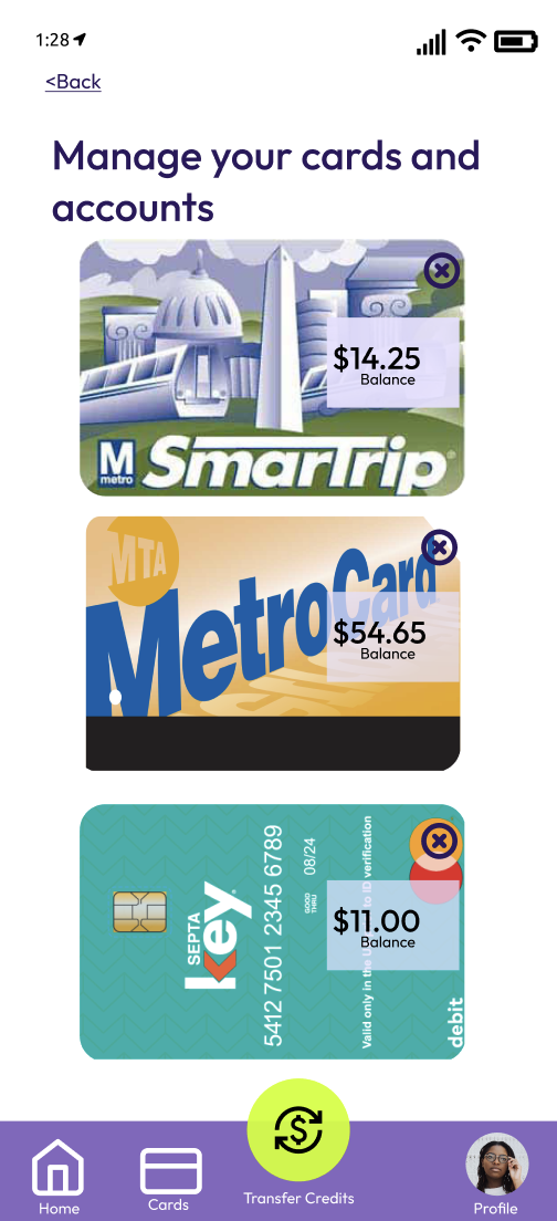
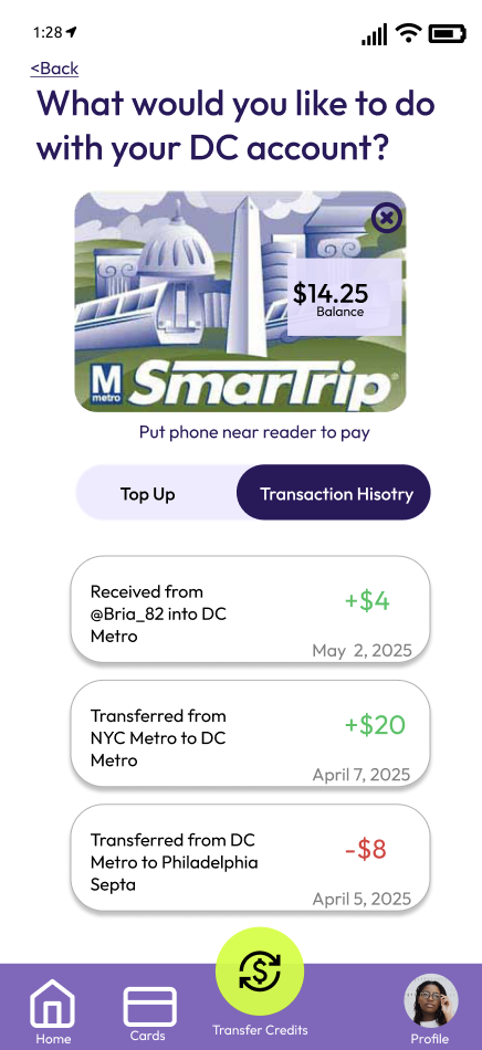
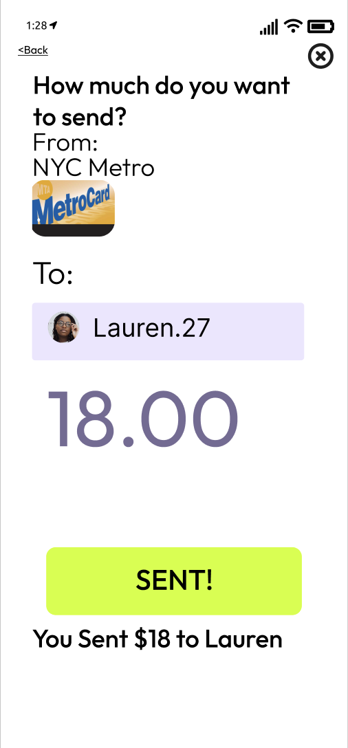
TransitSync: A mobile and smartwatch app that serves as a cross-city transit wallet, enabling users to:Inspired by platforms like Zelle, Venmo and Apple Wallet, TransitSync is a “super app” for transit credit management, fostering smarter, more sustainable travel behaviors.
Transfer credits between systems (like SEPTA to NYC MTA)
Send or gift credits to friends
Track all balances in one place
Digitally store passes to reduce physical card clutter
3.User Research:
Research Methods
User Interviews (n=3): Focused on frequent domestic travelers within the U.S.
Survey (n=14): Collected behavioral and preference data
Affinity Mapping: Clustered user pain points and needs
Persona Creation
Current Journey Mapping
I kicked of my research by interviewing 3 students and young professionals. These were the key interview Discussion Guide Questions:
How often do you travel between cities?
Have you had leftover transit credits?
What do you do with them?
Would a cross-city transit wallet be useful?
What features would you want in such an app?
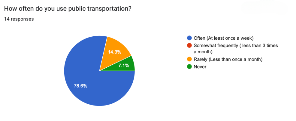
I then surveyed 14 people to get more quantitative data. The survey helped better inform my choices. Survey Highlights:
92.9% use public transit in their home cities
78.6% use it at least once a week
Most visited cities: New York, Philadelphia, Chicago, Washington D.C.
92.3% travel to visit family/friends
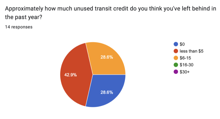
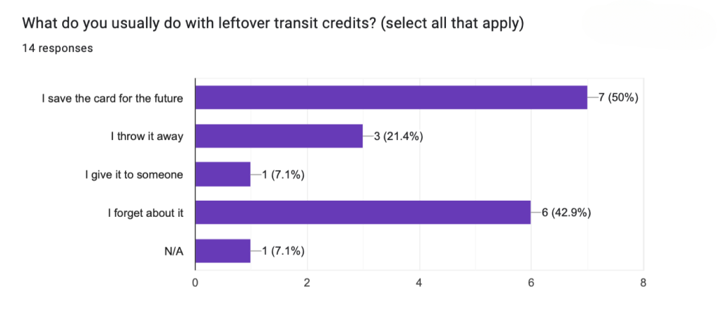
>75% reported leftover credit
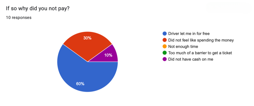
Common behavior: forget the card, throw it away, or never use it again
92.9% use Uber but liked public transport due to cost
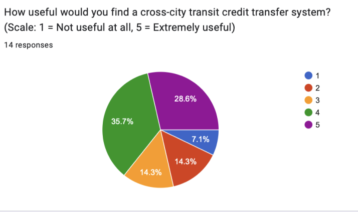
78.6% said they will find an app like TranistSync helpful
Skipping fares due to card issues is common, this shows pain points in access.
By creating a persona it helped me better visualize who I was designing for and how I could help Molly.
4. Molly,24
Profile: A financially savvy young professional frequently commuting between Philly, NYC, and D.C. She works in a creative field and thus travels a lot.
Concerned about budget and waste
Travels for work and personal trips
Open to sharing credits with friends
Desires flexibility and transparency in managing travel funds
5. Key Insights
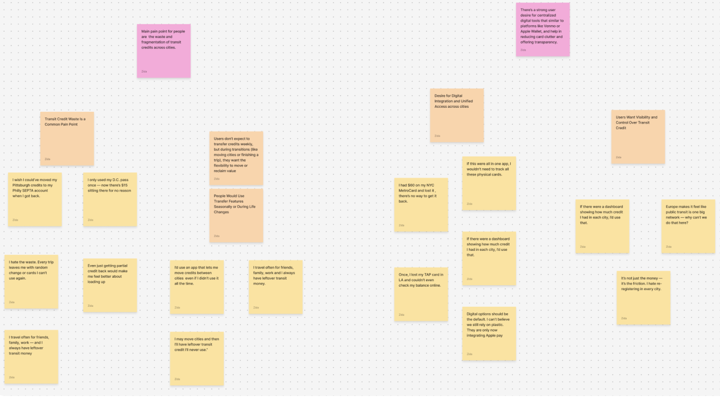
Through affinity mapping I came up with some key insights:
Users dislike wasting money on non-transferable credits
There is demand for a centralized digital wallet for transit, akin to Venmo or Apple Wallet
Users want a trusted, clean interface to manage funds
Interest in social features like donating/gifting credit
6. Opportunities and How Might We’s
I turned Insight statements into opportunties (How might we statements)
As a traveler, I want to transfer leftover transit credits so I don’t waste money --> HMW enable users to easily transfer or convert leftover credits across city systems?
As someone who loses cards, I want a digital version of my passes --> HMW create a digital, unified transit wallet that reduces the need for physical cards?
As a commuter, I want to see all my credit balances in one place --> HMW simplify the management of multiple transit systems in one UI?
As a thoughtful user, I want to donate unused credits --> HMW integrate social features like gifting or sharing credits?
As a frequent traveler, I want to manage credits like airline miles --> HMW design a system that works seamlessly across local and national transit systems?
7. Competitive Analysis
While no direct competitor offers cross-city credit transfers, I made some important observations, including:
PRT Ready2Ride (Pittsburgh) and SEPTA App (Philadelphia): These apps only work for individual city transits.
Venmo/Zelle: Inspired the peer-to-peer transfer feature
Apple Wallet: Inspiration for consolidated pass storage
TransitSync fills a gap, which is that there is no current solution allows inter-city transfers or credit donations.
8. Design Process
I mapped the user flow and journey before I started iterating my wire frames.
9. Wireframes (Low-fidelity)
Hand-drawn wireframes, later digitized and iterated in Figma
My wireframes focused on features that easily allowed people to transfer their credits, and sign up for an account. Helping reduce the resistance in having a transit account, and sharing money.
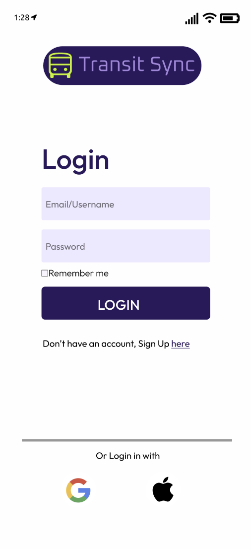
10.UI Ideation
For my UI, I was inspired by Venmo’s relaxed, accessible but not childish feel. I wanted my app to feel trustworthy, approachable and not overly corporate. This is how I achieved that:
Visual System
60/30/10 Color Rule:
60% white background
30% shades of purple
10% neon accent color
Font:
Primary: Outfit
Sizes: 32, 24, 16, 14, 12
Logo Font: Oxianium- modern, industrial mechanical feel to evoke transit systems
Additionally I incorporated the 10 heuristics, specifically:
2- Match between system and real word, by using transit cards that were identical to physical cards in my design
3- User Control and Freedom, easy navigation, with navigation bar
5/9- Error Prevention, and Recover for errors, with access to a cancel button, and prompts in case users are making a mistake.
8- Minimalist design
10- Help and documentation, this is displayed in the profile page.
The Design is also accessible, I iterated and changed to make the contrast of at least 4.5:1
I included a table of the most popular cities transit prices upon users request.
I designed for mobile and watch to support users on-the-go. From my interviews, users seemed more willing to use their mobile phones and watch, as opposed to desktop.
12.Conclusion on Final Designs
TransitSync’s final prototype offers users a seamless, thoughtful way to manage transit credits—turning fragmented systems into an interconnected, user-friendly experience.
Video of the app's flow
13.Reflections:
Things to improve on for next time:
When I write my survey questions, I will make sure there is no space for misinterpretation of my questions. I had to edit some questions after releasing the survey for clarity.
My interviewees where very east coast heavy, although some occasionally went to cities like Austin or SF, I would make an even stronger effort to find people in other regions of the US.
In general this project thought me a lot about synthesizing data and creating a well flowing app design that solves users problems.